
Color Theory in Brand Design
August 12, 2020
I think one of the reasons I truly fell in love with art and design was my love for color. In college, I would get so excited strolling through the racks of the local art supply store, adding all my favorite tubes of paint to my basket. I do the same thing at Sephora! 😂 I am obsessed with eyeshadow palettes. It sounds crazy, but buying new paint and eyeshadow really gives me the exact same thrill. I always fall in love with their rich hues, shades, and pigments because they inspire me to create. That’s the power of color theory in brand design.
Color theory is an important element many look over. Your branding should make your audience do both those things that I described above: feel something, and take action! Researching color for your brand design is one of the ways you can ensure a holistic approach to your brand identity and inspire customers to feel a certain way.
I’ve put together a few highlights below of the meaning behind core colors, along with some inspiring flat lays using various objects from around my studio.
Red
Dynamic, bold, and stimulating, red is often associated with passion and energy. It comes in so many beautiful hues from deep cabernets to flirty corals. I love the romantic feel and intensity that red evokes, from shades of brick red lipstick to bright red poppies scattered in a field.
Brittany Spears said it best in her insta post:
“Red is the highest arc of the rainbow 🌈 !!! It encourages action and confidence …. red is all heart ❤️ …. the longest wavelength of light is red. Red is also courage, attention, and passion. The color red naturally draws attention 😘😘😘🌹🌹🌹🌹💋💋👠 !!!!”
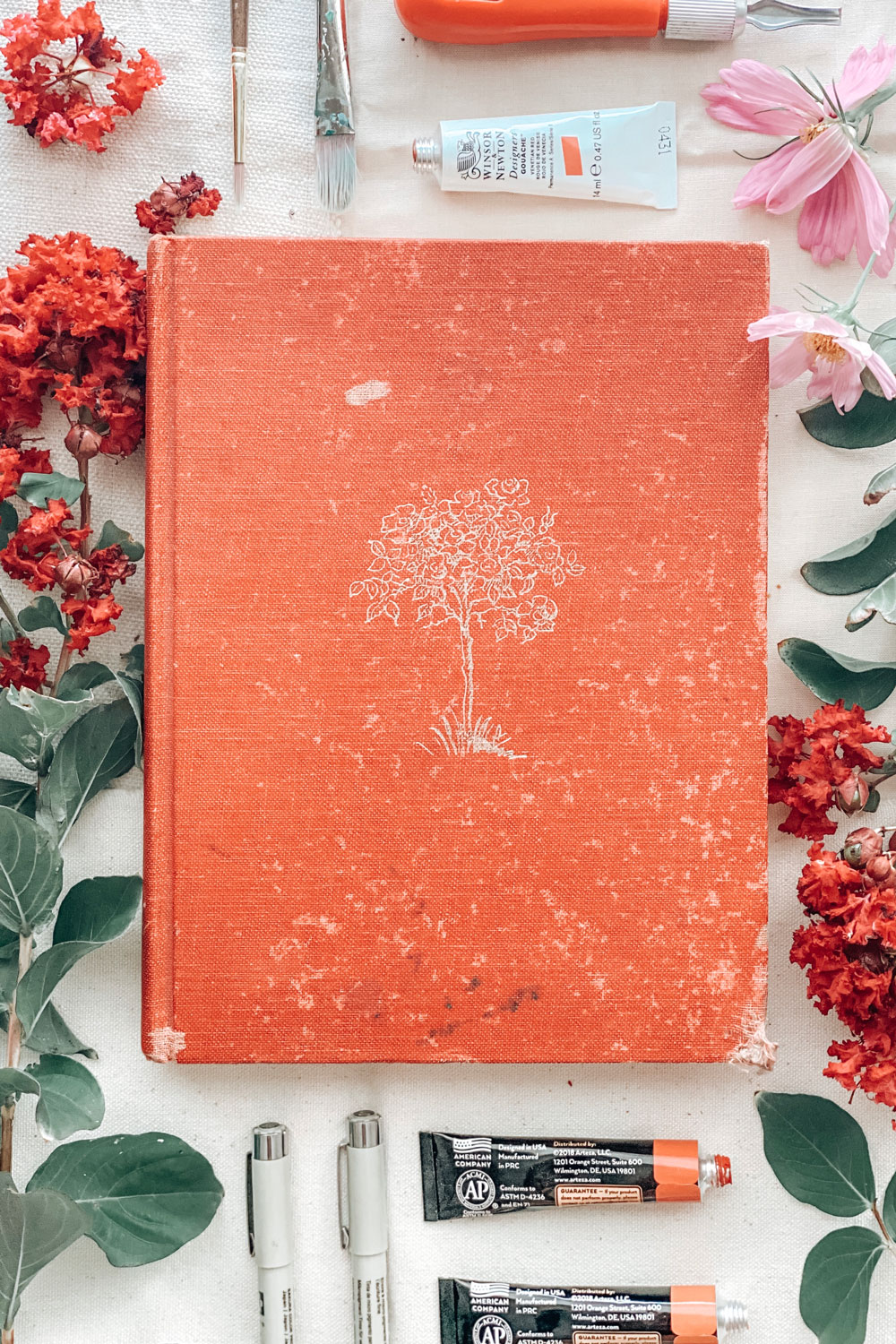
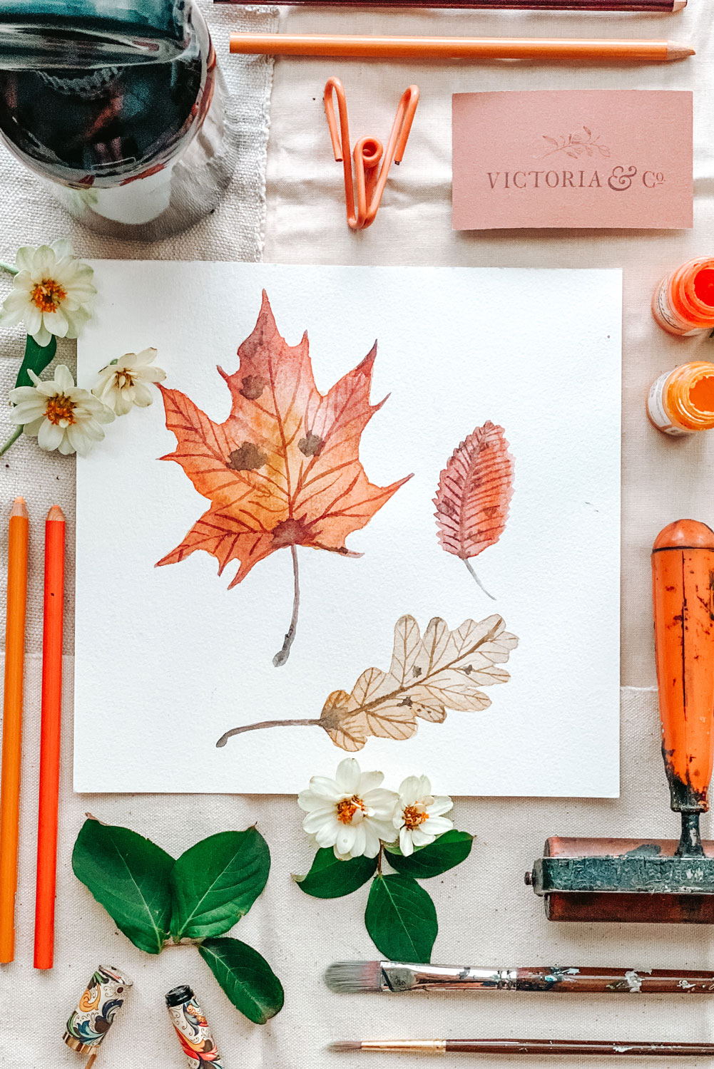
Orange
Orange is another bold color that inspires warmth in its hues. Born from the infusion of red and yellow, it’s energetic and playful demeanor add zest to any palette. My favorite visions of orange are those that come with autumn in earthier notes like terracotta. I’m always so entranced by the overload of orange hues through falling leaves, pumpkin gourds, and spiced cider.
“I’m so glad I live in a world where there are Octobers.”
L.M. Montgomery from Anne of Green Gables
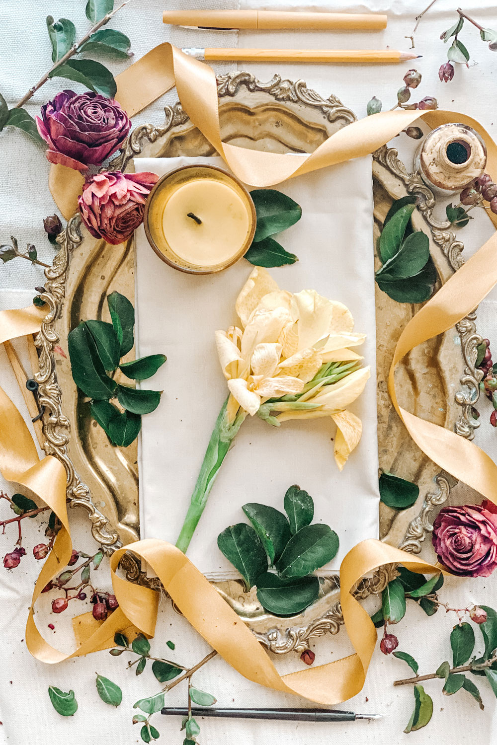
Yellow
Merry and luminous, yellow represents optimism and cheer. From bright yellow rain boots on a stormy day, to towering golden sunflowers in the summertime, yellow inspires positivity. If you ask my dad, who is color blind, what his favorite color is, he’ll say yellow! Evidently it’s the only color he can actually see. I find it so interesting that even though his vision is color impaired he can still see bright, cheery yellow tinges.
The best example I can give as a well-known, metaphorical use of yellow is from the Wizard of Oz:
“Follow the yellow brick road!”
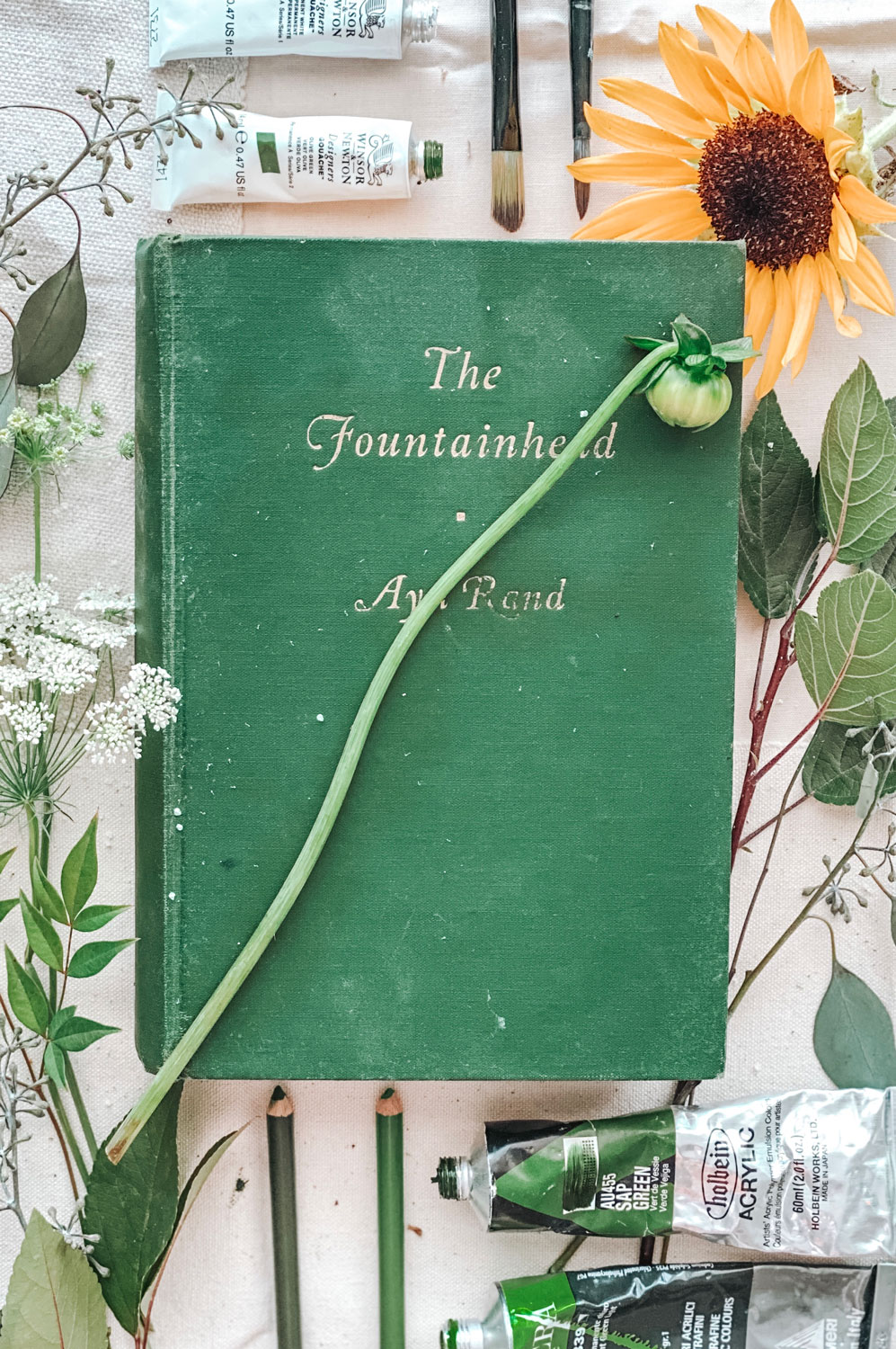
Green
I adore green and its direct ties to nature. I have more shades of green paint than any other color! Its peaceful presence conjures up images of serene landscapes that are soothing to the eyes . Above all, I admire the strong symbolic meaning of “evergreen.” Greens ties to ambition and prosperity also make it easy to see why it is often used for color theory in brand design.
Green inspiration by my favorite poet, Tyler Knott Gregson:
“Point me at all things green, all things that grow. Life is the North to my compass, magnetically it pulls me home.”
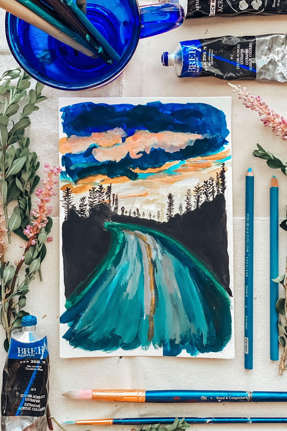
Blue
Blue is the empress of the color wheel, taking prize for the most common favorite color. Demonstrating trustworthiness, strength, protection, and intelligence, it’s a color that easily applies to so many different businesses and their missions. Nothing makes me feel more productive than a sunny day painted with big, blue skies. From soft powder blues to rich cobalts, and deep sinking navys to turquoise waters, the breadth of blue is as limitless as the ocean and sky themselves.
My favorite symbolic use of this color is from the term “haint blue.” Visit a quintessential wrap-around porch in the South and you’ll see their ceilings covered in light blue paint. The blue was meant to protect the home from “haints” by tricking the spirits into believing it was either the sky for them to pass through, or water that they couldn’t cross.
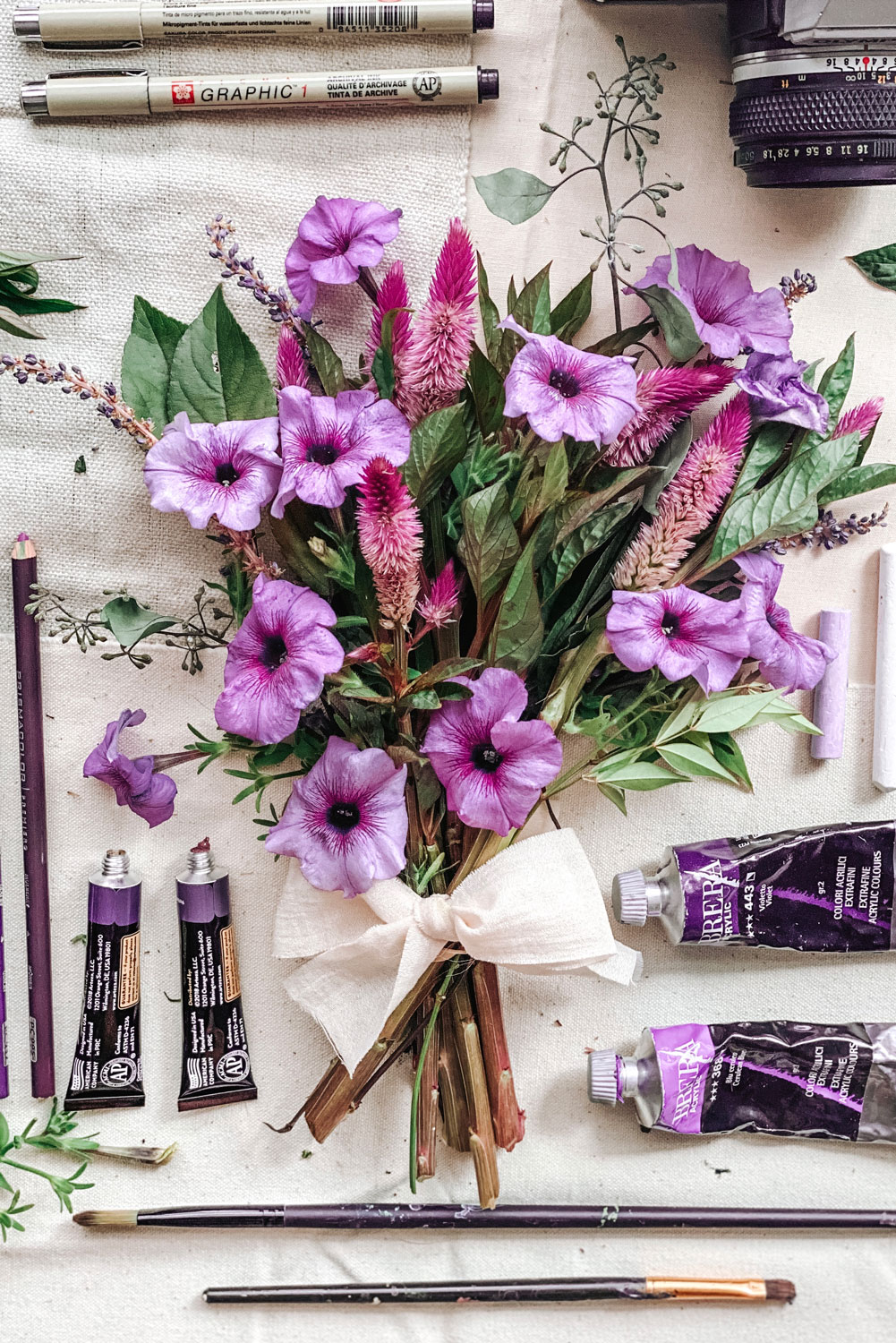
Purple
Mysterious, regal, and graceful, purple is for the luxurious. Darker shades of plum and violet feel rich and velvety, while delicate mauves and lilacs add a hint of feminism. In nature, purple is the most rare color adding to its special quality. My love for the soft scent and color of lavender resonates the most with me among this color group.
When I think of purple flowers, I always think of the purple Iris. Signifying royalty, the flower inspired the well-known French fleur-de-lis symbol long ago.
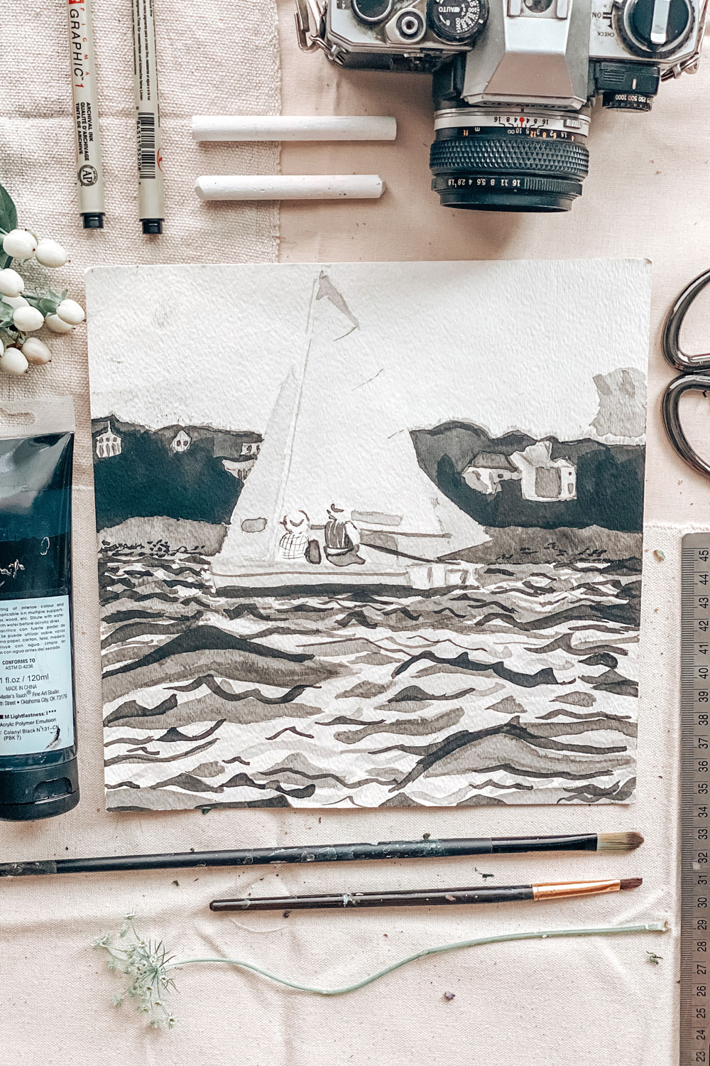
Black
Nothing is more timeless and sophisticated as black. Dark, daring, and bold, its a classic go-to as a focal palette for color theory in brand design. Its suave semblance adds definition and contrast like no other hue can. If you’ve ever painted with black, you’ll know how powerful its pigment is and how just the tiniest speck can darken a color several shades. Copious amounts of black feels powerful and awe-inspiring, like the overwhelming feeling you get when you stare up at the night sky.
From the famous American painter, Georgia O’Keeffe:
“There’s something about black. You feel hidden away in it.”
I hope you enjoyed this color overload! If you’re in the middle of brainstorming ideas for your brand, I encourage you to research both the positive and negative connotations associated with your color selections. If anything, it will give you an even deeper connection to your brand and its meaning. I would love to hear more about anything interesting you find!
My goal through my artwork is to inspire creativity in others and to give business owners a passion for their brand. If you are interested in either of those things, scroll a little further and subscribe to be the first to know about art prints for sale, brand design advice, latest project releases, and more!
Sincerely, Vicky
To view my services, click here
For more about me, click here
To view more of my portfolio, click here
at @victoriacodesign

