
Podcast Brand Design: Ant’s Atmosphere
October 5, 2020
About the Podcast
The podcasting duo, cousins Anthony (host) and Ryan (producer), are back at it again with a second podcast brand design for Ant’s Atmosphere! If you’ve been following my project releases you’ll recognize Ryan and Anthony from our first project collaboration, the Cinema Roll Podcast (check it out here). I was really excited when they approached me about their newest venture with Ant’s Atmosphere.
Ant’s Atmosphere, now on it’s 9th episode, goes behind-the-scenes with local musicians. The interview-style podcast invites special guests onto the show to learn more about the inspirations, road blocks, and future endeavors of various artists in the local music scene.
Anthony’s preliminary inspiration he sent over to me included a bold black and white sketch of a face. He also wanted to play up the ‘Atmosphere’ portion of the name, focusing on a galaxy vibe. With this in mind along with the musical content of the podcast, I went to work.
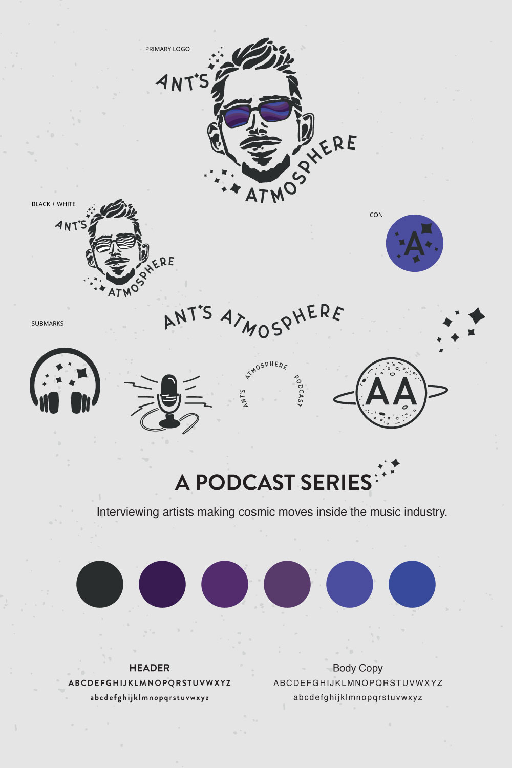
Primary Logo
I started with the trickiest part of the logo – the illustration of Anthony. I first drew it out on cardstock with pencil sketching out his face. To match the original inspiration photo, I focused on blockier shapes to create his facial structure and details. Once I felt like I had it where I wanted, I traced and filled with micron pens. I try to do this process on top of a light pad so I can clearly see the lines. After the drawing was outlined and filled, I erased the pencil marks and took a photo that I vectorized in Illustrator.
Next, I brought in color to Anthony’s glasses. He had originally suggested something that emphasized the galactic feel of the logo. Afterward, we ended up on these retro wavy lines that I felt were a nod to the musical industry. Reminiscent of old-school record covers, I thought the lines fit well inside the shapes while bringing it movement. I also wanted to be particular about the color of the wavy lines. Using five different shades of blue and purple, I thought it could be a fun way to later tie in a musical staff with the brand.
After the focal point of the logo was finished, I added ‘Ant’s Atmosphere’ around the overall shape. I wanted the movement to mimic the wavy lines inside his glasses. The difference in length between ‘Ant’ and ‘Atmosphere’ made it a little harder to give it a symmetrical feel. Thankfully after much adjusting, I was able to bring it enough balance. Lastly, I included the stars to bring it more of the celestial look.
Submarks
The additional logo variations really tied in the atmospheric look Anthony was wanting. In the submarks I added headphones, a retro-looking mic, and a planet. I wanted to keep the same hand-drawn look with these elements, while also making them versatile enough for different uses. These pieces can be easily translated from website, to stickers, to apparel, and more.
The podcast brand design for Ant’s Atmosphere was such a fun project to work on. I really loved how it turned out and how Anthony and Ryan are already using their brand design! Ant’s Atmosphere is doing some big things so be sure to follow them at @antsatmosphere on Instagram. Their episodes can be found on every podcast platform, so look them up and check out their latest releases!
Sincerely, Vicky
To view my services, click here
For more about me, click here
To view more of my portfolio, click here
at @victoriacodesign

