
Home Renovation Brand: Rusted Nail
April 28, 2021
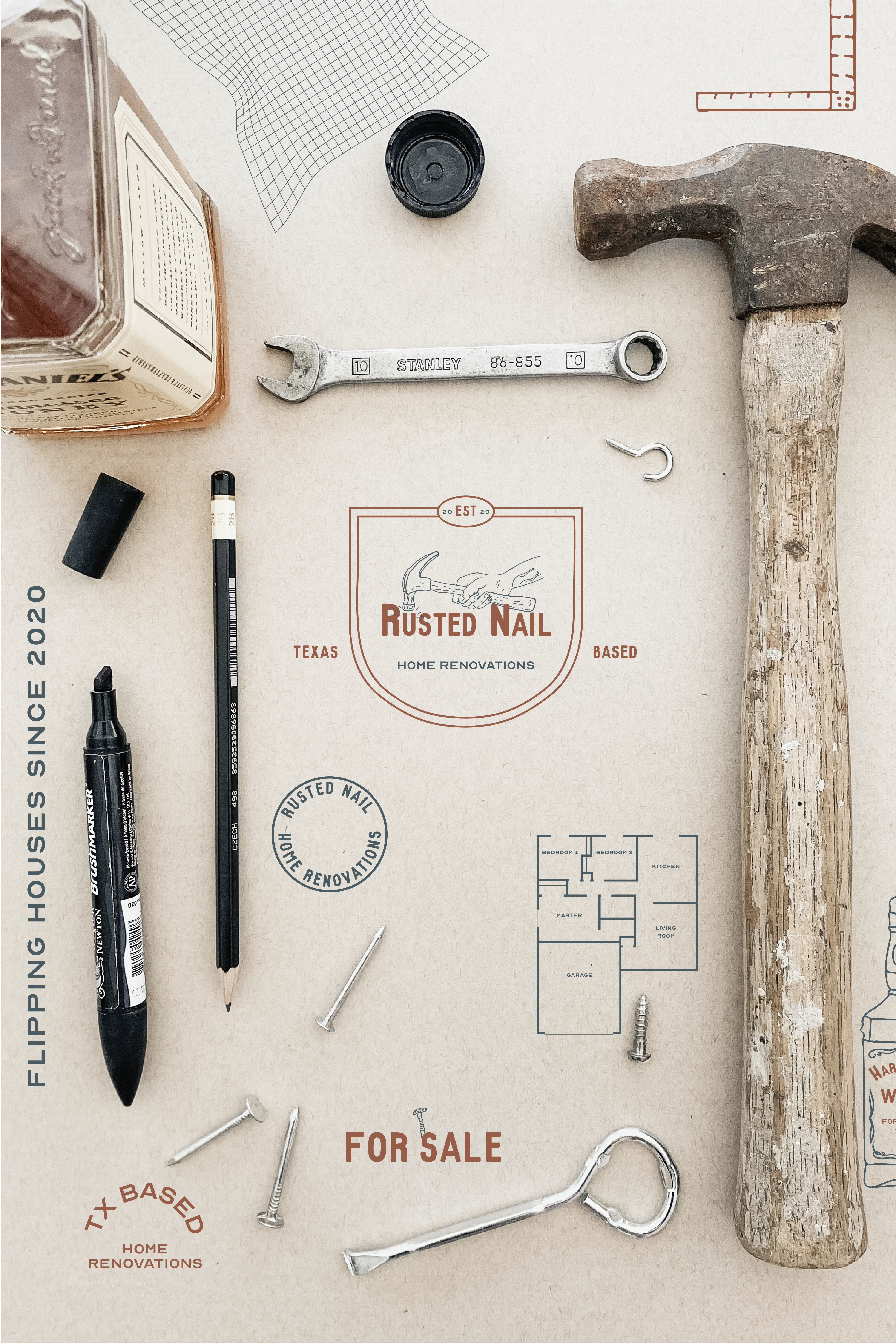
Last year in our house-flipping adventures, I naturally began to brainstorm branding ideas. Stepping on rusted nails inside the old houses became a common occurrence as we finished up one home and went on to the next! So here we are with the mock brand design for Rusted Nail, the home renovation brand packed with the personality of a couple guys I know. Yes, that’s a whiskey bottle.
When putting together this home renovation brand, I wanted it to have a retro vibe with an overall burly appearance. I handdrew the hand and hammer illustration with a micron pen on a heavy piece of card stock. Using simple line stroke detail, I emphasized the aged appearance of the hammer. In the same way, I added veins to the hand to give it a more masculine feel.
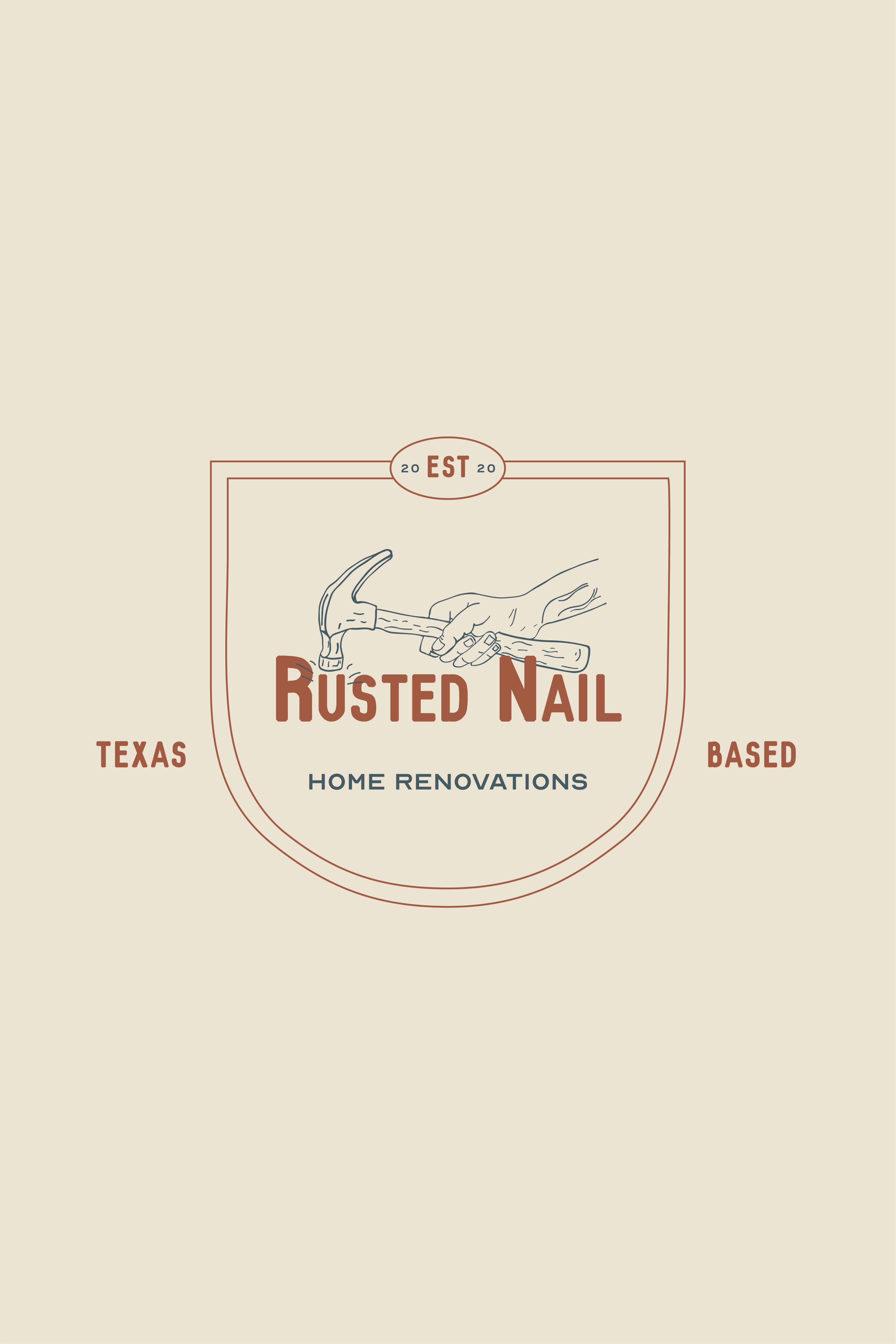
My favorite logos in my portfolio are the ones where the illustration interacts with the surrounding elements. Here, I added the text underneath the illustration in a way that it looks like it’s being hammered down. The overall badge shape was created to add greater emphasis to the feeling of strength and sturdiness through the shield-shaped perimeter.
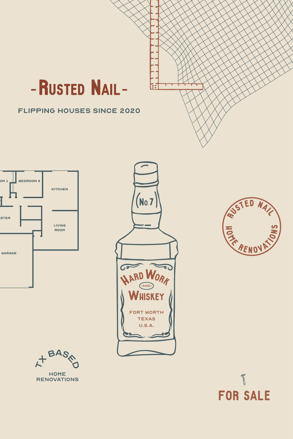
Other submarks in the brand include an illustrated whiskey bottle, floor plan, L-square, architect grid paper, and a rusted nail. I also included other simplified logo variations with a clean appearance to complement the rest of the more detailed look.
Overall, I love how this home renovation brand turned out for this mock project! It’s always so fun getting to think outside of the box on projects like this and really cater to a specific personality with no creative boundaries. What’s your favorite part of the Rusted Nail brand?
Sincerely, Vicky
at @victoriacodesign

