
Your Logo Isn’t Your Brand
March 10, 2021
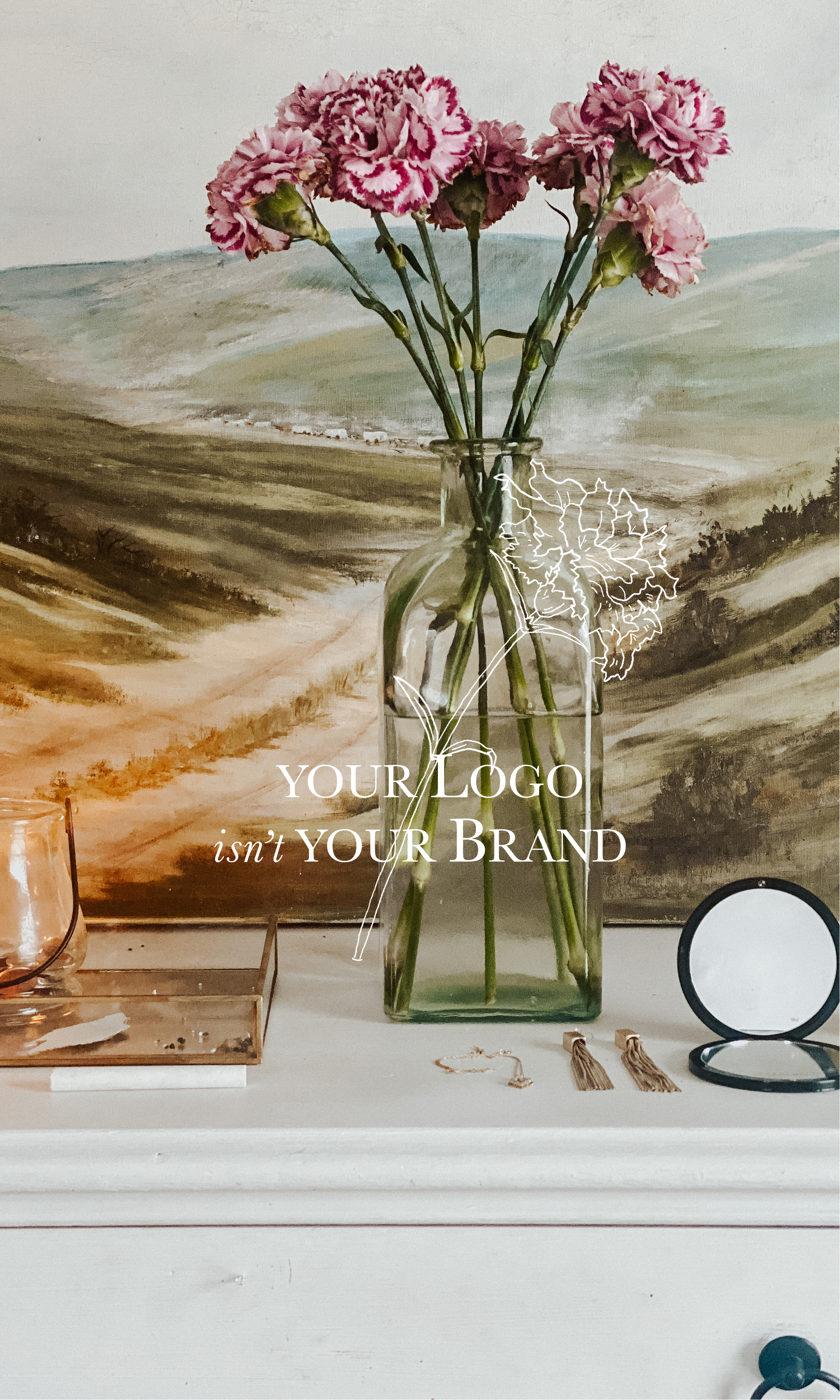
Have you ever wondered what the difference between a brand and a logo is? To help break down the depth a well-rounded brand can bring, I’ll walk you through the brand design of Norman’s Paper Co. – the pop-up shop that started my career as a brand designer!
This is the primary logo for Norman’s Paper Co. The floral illustrations give it a feminine feel and clue us in on what the products might be like. You may also guess the dog in the middle could be Norman. While this one design element can serve several purposes, it still doesn’t cover every scenario. This is where we bring in the other design components!
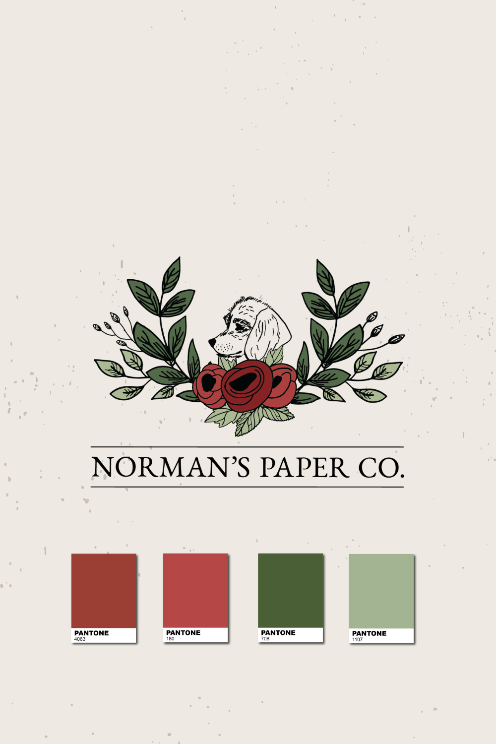
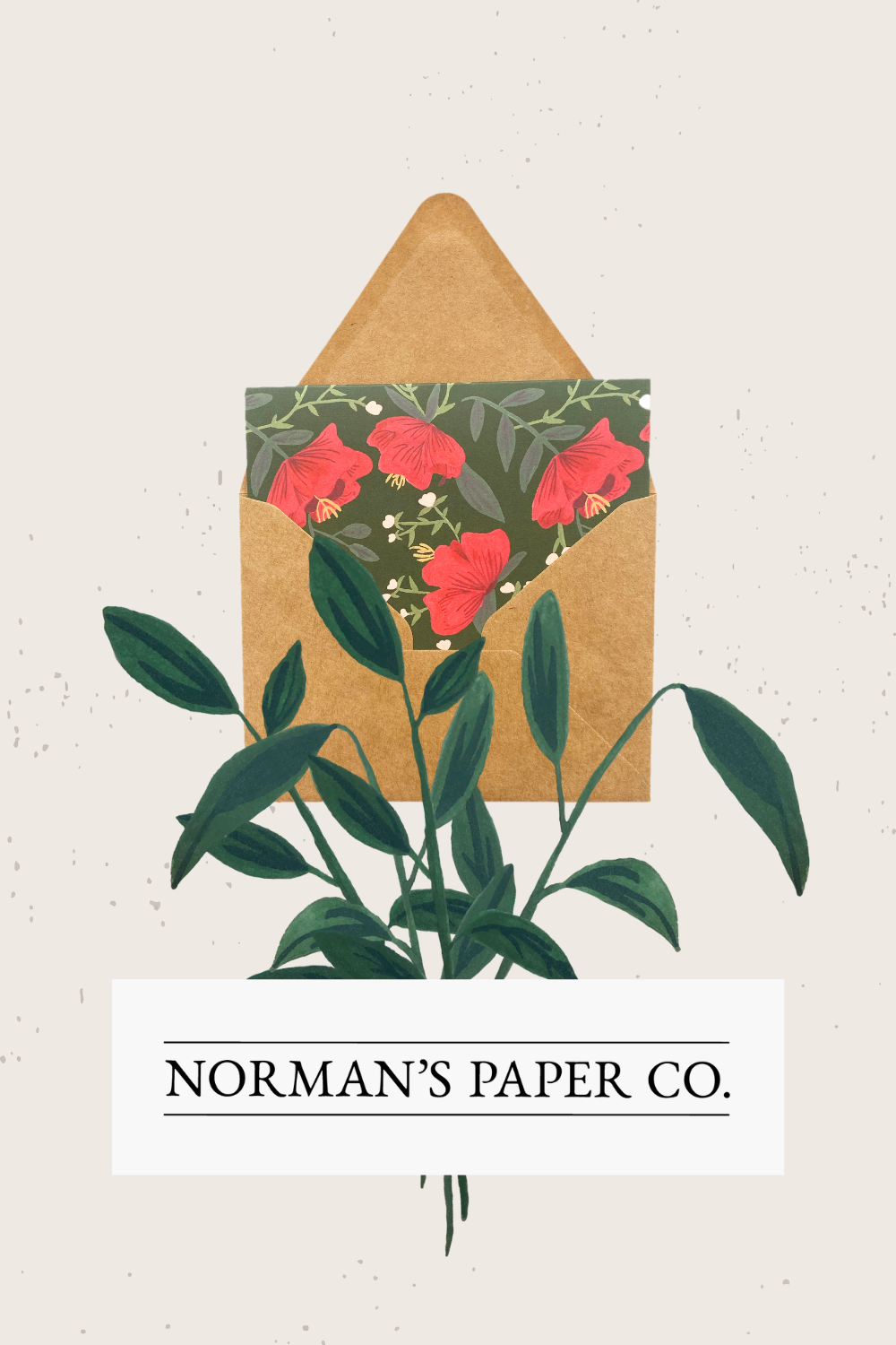
Here we introduce the color palette. The colors for Norman’s Paper Co. are bright and bold with punchy contrast that still coincides with the natural imagery of the floral and greenery illustrations.
To read more on Color Theory in Brand Design, be sure to check out the blog post for it here!
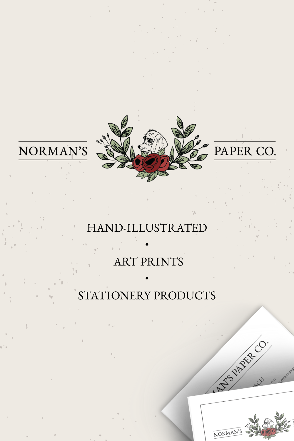
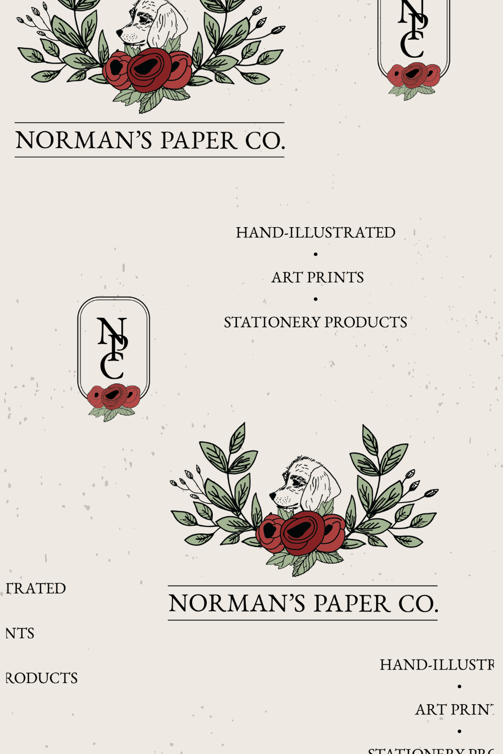
Here is the secondary version of the logo. The horizontal layout makes it more suitable for longer and shorter spaces. This will come in handy for things like banners, page headers, or even a business card. Because of the narrow shape, it covers more space that the primary logo wouldn’t be able to in a more rectangular area.
Also included in this example is the introduction of the tagline. I love taglines in brand design because they act as a descriptor, are versatile enough to pair with other logo elements, and can show off your typography.
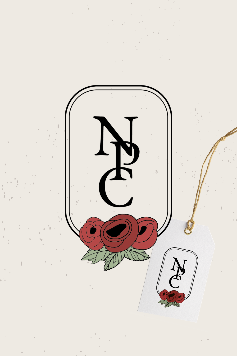
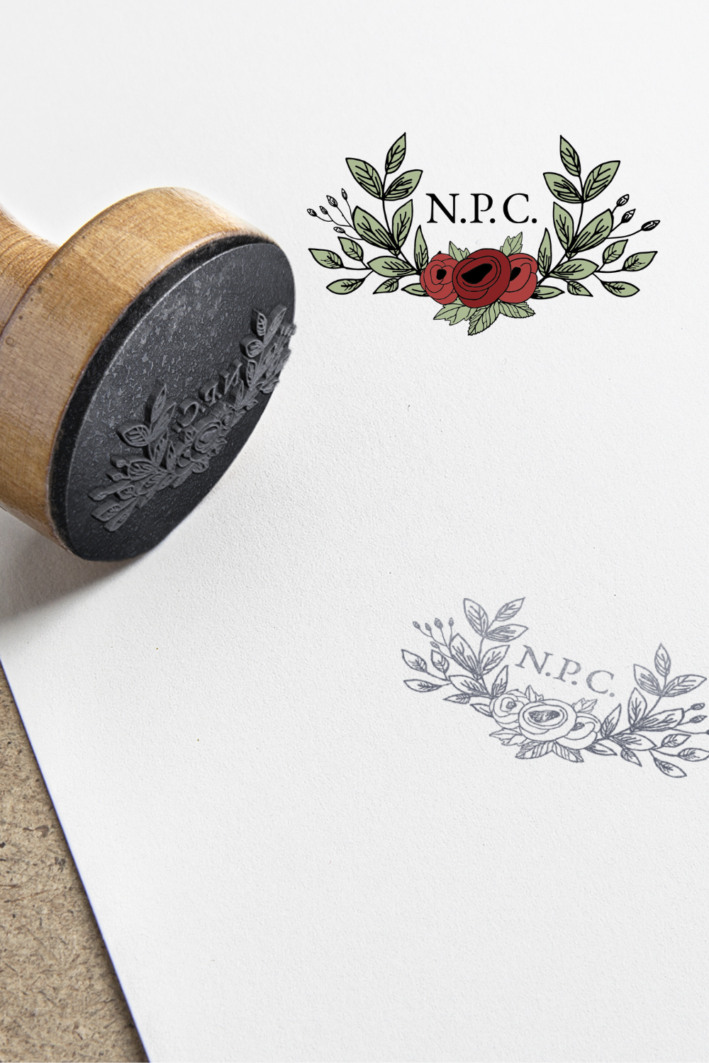
Submarks are another component of brand design that offer more versatility and expression than just your logo. A submark could be used on custom stationery, clothing tags, product labels, packaging and more! Think of it like the final ribbon wrapped around a gift – it makes the brand stand out as more luxurious and well-thought out.
Lastly, a pattern of all the design elements brought together. Perfect for gift wrap or tissue paper for product-based businesses!
Norman’s Paper Co. is bright, colorful, feminine, and has a floral-inspired, illustrative feel. Because of the branding, you can get a sense of what NPC is and who they’re trying to reach with their products.
Your brand is not just your logo! It’s your color scheme, typography, and overall look and feel you exhibit. It shows off your personality and in turn attracts your ideal clients. Your brand allows your audience to connect with you which is a major selling point for small businesses.
What about you – is your brand just your logo? Drop you questions and comments below!
Sincerely, Vicky
To view my services, click here
For more about me, click here
To view more of my portfolio, click here
at @victoriacodesign

